A History of US Stock Market Returns
2013 was a terrific year in the US stock market with the index of the largest 500 US companies (the S&P 500 index) returning 32.3% (gains and dividends). How does it compare to recent history?
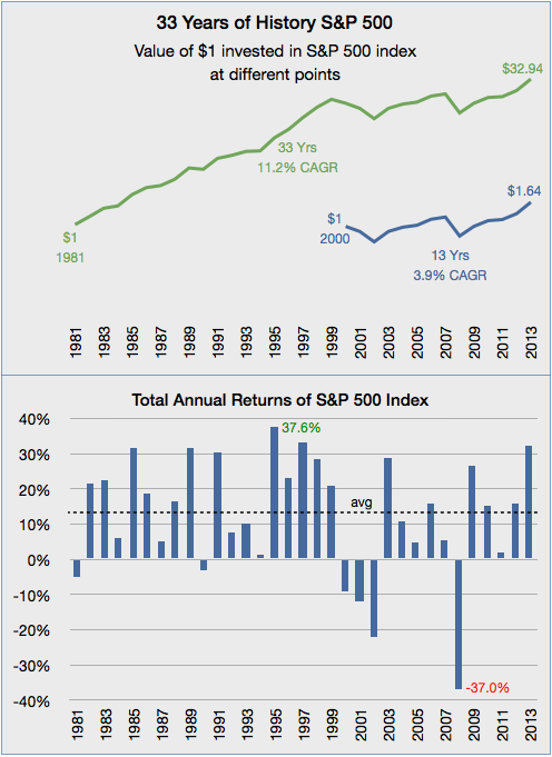
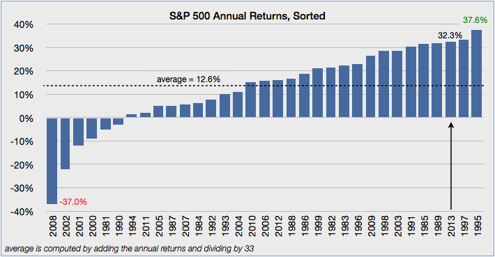
These charts show 33 years of data beginning in 1981. 2013’s return of 32.3% is the third best, after 1995 (37.6%) and 1997 (33.4%). See the bottom chart for a sorted set of returns from worst (negative 37.0% in 2008) to best.
An investment of $1 in an S&P500 index fund in 1981 would have grown to $32.94 by the end of 2013, returning a compound annual growth rate (CAGR) of 11.2% over the entire period. Great!
But timing is everything.

If that investor waited until the year 2000 to invest $1, his annualized return over the next 14 years would be 3.9% not 11.2% ! After 14 years his $1 would be $1.64. Forty cents of that 64¢ gain came last year. With inflation factored in, that’s not much return at all.
Starting in 1981, the annualized return for the next 14 years was 13.3%. So the two periods had very different returns.
It’s unlikely that an investor would be unlucky enough to put his entire investment into the market at the very peak in 2000. But this example helps illustrate the effect of a particularly bad period, and the value of investing new money over a period of time, to reduce timing risk.
Over time, investors have been rewarded, but there’s no guarantee and past returns won’t be future returns. One thing is sure: there will be ups and downs.

Important: This information is educational, not specific investment advice for an individual. Investing involves risk of loss. Past performance is no guarantee of future returns. A diversified portfolio does not protect against a loss or guarantee a gain.
