This Year in US Stocks: Comparing 2013 to Past Years
So far in 2013, the S&P500 index — the stock index of the largest 500 companies in the US — is up about 17% (not including dividends). That’s a very good year. But has it been volatile in achieving those gains?
In investing, the term “volatility” refers to the amount of “bouncing” — high highs and low lows. A large amount of volatility means big changes, both up and down.
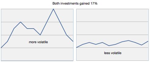
A stock or index with high volatility is said to have more risk. In this chart, both investments gained 17% during the period but the one on the left had much more volatility.
For the S&P 500 index comparison, I looked at new highs (peaks) and compared peaks to troughs. All 2013 data is through November 5.

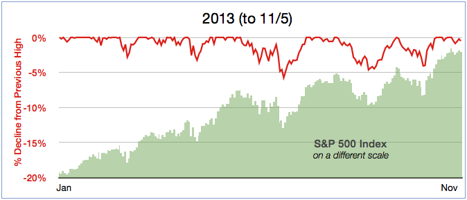
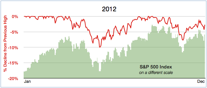
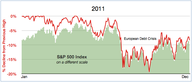
For each day this year, the S&P 500 index closed at a new high 27% of the time. Last year it was 13%, and 2011 it was only 8%. This has been a good year.
Did those new highs this year come with big declines? No. The worst decline so far was -5.8%.
By comparison, in 2011, the worst decline was almost -20% and only 8% of days were new highs. That year the index ended down about -2%. The European debt crisis was primarily to blame. A decline of 2% for the year might not seem too bad, but along the way it was a pretty scary ride. That’s volatility.
A -20% decline is a big drop, and it’s worth keeping in mind that stocks are so-called “risky” assets, even outside of the years we associate with headline-grabbing drops like 2008-2009, 2001-2002, 1998, and 1987.
The red line in the charts below shows how much the index has declined from the most recent high at that point in the year. When the index is at a new high, the decline is 0% — at the top of the graph. The scale for %Decline is the same across all three years, so you can see this year has been much less volatile than past years, even with concerns raised by the Fed and the government budget/debt controversy.
Stocks are generally considered volatile, but these charts show that in short periods (1 year) the volatility can be large or small, even for the same index, because of other factors.
Investors can get lulled into thinking that nice returns for a couple of years means those returns will continue. We don’t know what returns are ahead, but at least this year we can enjoy the returns that have been very good, and came with less volatility than the recent past.


Important: This information is educational in nature and not specific investment advice. Investing involves risk of loss. Past performance is no guarantee of future returns. A diversified portfolio does not protect against a loss or guarantee a gain.
